主题 Theme
概览 Overview
颜色 Color
深色模式 Dark mode
排版 Typography
间距 Spacing
断点 Breakpoints
圆角 Radius
阴影 Shadows
光标 Cursors
组件
警报对话框 Alert Dialog
纵横比 Aspect Ratio
头像 Avatar
徽章 Badge
按钮 Button
提示框 Callout
卡片Card
复选框 Checkbox
复选框组合 Checkbox Group
复选框卡片 Checkbox Cards
上下文菜单 Context Menu
数据列表 Data List
对话框 Dialog
下拉菜单 Dropdown Menu
悬停卡片 Hover Card
图标按钮 Icon Button
插入 Inset
弹出框 Popover
进度条 Progress
单选框 Radio
单选框组合 Radio Group
单选框卡片 Radio Cards
滚动区域 Scroll Area
分段控制 Segmented Control
选择 Select
分隔线 Separator
骨架 Skeleton
滚动条 Slider
加载指示器 Spinner
开关 Switch
表格 Table
标签 Tabs
标签导航 Tab Nav
文本区域 Text Area
文本字段 Text Field
工具提示 Tooltip
Components
卡片
用于分组相关内容和操作的容器。
Teodros Girmay
工程师
<Box maxWidth="240px">
	<Card>
		<Flex gap="3" align="center">
			<Avatar
				size="3"
				src="https://images.unsplash.com/photo-1607346256330-dee7af15f7c5?&w=64&h=64&dpr=2&q=70&crop=focalpoint&fp-x=0.67&fp-y=0.5&fp-z=1.4&fit=crop"
				radius="full"
				fallback="T"
			/>
			<Box>
				<Text as="div" size="2" weight="bold">
					Teodros Girmay
				</Text>
				<Text as="div" size="2" color="gray">
					工程师
				</Text>
			</Box>
		</Flex>
	</Card>
</Box>
API 参考
此组件基于 div 元素,并支持 常见的边距属性。
| Prop | Type | Default |
|---|---|---|
asChild | boolean | No default value |
size | Responsive<"1" | "2" | "3" | "4" | "5"> | "1" |
variant | "surface" | "classic" | "ghost" | "surface" |
示例
作为其他元素
使用 asChild 属性将卡片呈现为链接或按钮。此属性为交互状态(如悬停和聚焦)添加样式。
<Box maxWidth="350px">
	<Card asChild>
		<a href="#">
			<Text as="div" size="2" weight="bold">
				快速开始
			</Text>
			<Text as="div" color="gray" size="2">
				在几分钟内开始构建下一个项目
			</Text>
		</a>
	</Card>
</Box>
大小
使用 size 属性来控制大小。
Teodros Girmay
工程师
Teodros Girmay
工程师
Teodros Girmay
工程师
<Flex gap="3" direction="column">
	<Box width="350px">
		<Card size="1">
			<Flex gap="3" align="center">
				<Avatar size="3" radius="full" fallback="T" color="indigo" />
				<Box>
					<Text as="div" size="2" weight="bold">
						Teodros Girmay
					</Text>
					<Text as="div" size="2" color="gray">
						工程师
					</Text>
				</Box>
			</Flex>
		</Card>
	</Box>

	<Box width="400px">
		<Card size="2">
			<Flex gap="4" align="center">
				<Avatar size="4" radius="full" fallback="T" color="indigo" />
				<Box>
					<Text as="div" weight="bold">
						Teodros Girmay
					</Text>
					<Text as="div" color="gray">
						工程师
					</Text>
				</Box>
			</Flex>
		</Card>
	</Box>

	<Box width="500px">
		<Card size="3">
			<Flex gap="4" align="center">
				<Avatar size="5" radius="full" fallback="T" color="indigo" />
				<Box>
					<Text as="div" size="4" weight="bold">
						Teodros Girmay
					</Text>
					<Text as="div" size="4" color="gray">
						工程师
					</Text>
				</Box>
			</Flex>
		</Card>
	</Box>
</Flex>
变体
使用 variant 属性来控制视觉样式。
快速开始
在几分钟内开始构建下一个项目
快速开始
在几分钟内开始构建下一个项目
<Flex direction="column" gap="3" maxWidth="350px">
	<Card variant="surface">
		<Text as="div" size="2" weight="bold">
			快速开始
		</Text>
		<Text as="div" color="gray" size="2">
			在几分钟内开始构建下一个项目
		</Text>
	</Card>

	<Card variant="classic">
		<Text as="div" size="2" weight="bold">
			快速开始
		</Text>
		<Text as="div" color="gray" size="2">
			在几分钟内开始构建下一个项目
		</Text>
	</Card>
</Flex>
带有内嵌内容
使用 插入 组件将内容与卡片的边缘对齐。
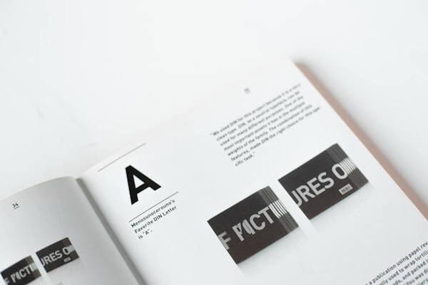
排版 是安排字体的艺术和技巧,使书面语言在显示时清晰、易读和吸引人。
<Box maxWidth="240px">
	<Card size="2">
		<Inset clip="padding-box" side="top" pb="current">
			<img
				src="https://images.unsplash.com/photo-1617050318658-a9a3175e34cb?ixlib=rb-4.0.3&ixid=M3wxMjA3fDB8MHxwaG90by1wYWdlfHx8fGVufDB8fHx8fA%3D%3D&auto=format&fit=crop&w=600&q=80"
				alt="大胆的排版"
				style={{
					display: "block",
					objectFit: "cover",
					width: "100%",
					height: 140,
					backgroundColor: "var(--gray-5)",
				}}
			/>
		</Inset>
		<Text as="p" size="3">
			<Strong>排版</Strong> 是安排字体的艺术和技巧,使书面语言在显示时清晰、易读和吸引人。
		</Text>
	</Card>
</Box>
上一篇提示框 Callout
下一篇复选框 Checkbox