# 卡片

用于分组相关内容和操作的容器。

```jsx
<Box maxWidth="240px">
  <Card>
    <Flex gap="3" align="center">
      <Avatar
        size="3"
        src="https://images.unsplash.com/photo-1607346256330-dee7af15f7c5?&w=64&h=64&dpr=2&q=70&crop=focalpoint&fp-x=0.67&fp-y=0.5&fp-z=1.4&fit=crop"
        radius="full"
        fallback="T"
      />

      <Box>
        <Text as="div" size="2" weight="bold">
          Teodros Girmay
        </Text>

        <Text as="div" size="2" color="gray">
          工程师
        </Text>
      </Box>
    </Flex>
  </Card>
</Box>
```

## [API 参考](#api-参考)

此组件基于 `div` 元素，并支持 [常见的边距属性](/themes/docs/overview/layout#margin-props)。

| Prop      | Type                                          | Default          |
| --------- | --------------------------------------------- | ---------------- |
| `asChild` | `boolean`                                     | No default value |
| `size`    | `Responsive<"1" \| "2" \| "3" \| "4" \| "5">` | `"1"`            |
| `variant` | `"surface" \| "classic" \| "ghost"`           | `"surface"`      |

## [示例](#示例)

### [作为其他元素](#作为其他元素)

使用 `asChild` 属性将卡片呈现为链接或按钮。此属性为交互状态（如悬停和聚焦）添加样式。

```jsx
<Box maxWidth="350px">
  <Card asChild>
    <a href="#">
      <Text as="div" size="2" weight="bold">
        快速开始
      </Text>

      <Text as="div" color="gray" size="2">
        在几分钟内开始构建下一个项目
      </Text>
    </a>
  </Card>
</Box>
```

### [大小](#大小)

使用 `size` 属性来控制大小。

```jsx
<Flex gap="3" direction="column">
  <Box width="350px">
    <Card size="1">
      <Flex gap="3" align="center">
        <Avatar size="3" radius="full" fallback="T" color="indigo" />

        <Box>
          <Text as="div" size="2" weight="bold">
            Teodros Girmay
          </Text>

          <Text as="div" size="2" color="gray">
            工程师
          </Text>
        </Box>
      </Flex>
    </Card>
  </Box>

  <Box width="400px">
    <Card size="2">
      <Flex gap="4" align="center">
        <Avatar size="4" radius="full" fallback="T" color="indigo" />

        <Box>
          <Text as="div" weight="bold">
            Teodros Girmay
          </Text>

          <Text as="div" color="gray">
            工程师
          </Text>
        </Box>
      </Flex>
    </Card>
  </Box>

  <Box width="500px">
    <Card size="3">
      <Flex gap="4" align="center">
        <Avatar size="5" radius="full" fallback="T" color="indigo" />

        <Box>
          <Text as="div" size="4" weight="bold">
            Teodros Girmay
          </Text>

          <Text as="div" size="4" color="gray">
            工程师
          </Text>
        </Box>
      </Flex>
    </Card>
  </Box>
</Flex>
```

### [变体](#变体)

使用 `variant` 属性来控制视觉样式。

```jsx
<Flex direction="column" gap="3" maxWidth="350px">
  <Card variant="surface">
    <Text as="div" size="2" weight="bold">
      快速开始
    </Text>

    <Text as="div" color="gray" size="2">
      在几分钟内开始构建下一个项目
    </Text>
  </Card>

  <Card variant="classic">
    <Text as="div" size="2" weight="bold">
      快速开始
    </Text>

    <Text as="div" color="gray" size="2">
      在几分钟内开始构建下一个项目
    </Text>
  </Card>
</Flex>
```

### [带有内嵌内容](#带有内嵌内容)

使用 [插入](/themes/docs/components/inset) 组件将内容与卡片的边缘对齐。

```jsx
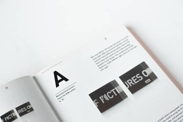
<Box maxWidth="240px">
  <Card size="2">
    <Inset clip="padding-box" side="top" pb="current">
      <img
        src="https://images.unsplash.com/photo-1617050318658-a9a3175e34cb?ixlib=rb-4.0.3&ixid=M3wxMjA3fDB8MHxwaG90by1wYWdlfHx8fGVufDB8fHx8fA%3D%3D&auto=format&fit=crop&w=600&q=80"
        alt="大胆的排版"
        style={{
          display: "block",
          objectFit: "cover",
          width: "100%",
          height: 140,
          backgroundColor: "var(--gray-5)",
        }}
      />
    </Inset>

    <Text as="p" size="3">
      <Strong>排版</Strong> 是安排字体的艺术和技巧，使书面语言在显示时清晰、易读和吸引人。
    </Text>
  </Card>
</Box>
```

<!--$-->

<!--/$-->
